True You Weight Loss is an endo bariatric center with offices in Cary, NC, and Atlanta.
Founded by Dr. Christopher McGowen, True You offers non-surgical solutions to treating obesity, such as minimally invasive procedures and comprehensive weight loss programs.

Informational Video Series: Project brief
The initial assignment
Dr. McGowen/True You is very active on YouTube and social media, posting informative videos for the public and current clients about alternative weight loss options and various endo bariatric procedures offered by their practice. They’d recently shot 3 separate videos via Blueforest Studios production company and needed edits and graphics for each. Each video was about 5 minutes long and would be posted on the TrueYou YouTube channel and sent directly to current patients via email. I was contracted by Blueforest to complete the edits and motion work.
My services
When I looked at True You’s YouTube page, digital marketing materials, video assets, and website, I found some quality-control issues that needed to be addressed before moving forward with the videos.
I then studied the production studio’s current motion templates to see where the consistency and quality gaps lay. From there, I offered them the following services:
Deliverables:
TrueYou Video Edits (3; 5-7 min each) with motion graphics
Graphics and usability/accessibility issues improved throughout
Brand Elevation and Motion Design Package
includes new, on-brand motion design templates for future use
My work also addressed the following:
Content design improvements
Learning and infographic improvements
Content scalability solutions for production and marketing team
3 Video Deliverables
Responsible for editing and color correcting 3, 5-7 min-long videos and adding supplementary motion graphics.
Final videos:
compare to this previous TrueYou video:
My improvements:
Addressing branding inconsistencies
True You’s videos didn’t embody the vibrancy and energy their most recent brand style guide was pushing.
TrueYou’s current online brand materials:


Off-brand video graphics:


color palette appears dulled and flattened
little variation in font weights
missing key elements:
Pantone 144 (yellow/orange)
diagonal lines are not incorporated
Solutions
Created a new, on-brand color palette for motion templates
Incorporated their signature diagonal line pattern covered in their style guide. It helped add an extra layer of texture, creating more depth in the designs.
Incorporated Pantone 144 (yellow/orange) into their gradients and used as an accent color in motion graphics
Graphic improvements | examples
Before redesign
After redesign
Motion Template Package
Brand assets | Title cards, chapter cards, lower thirds, infographics and charts
Brand elevation is pretty useless until you can maintain it. This is my gift to the production team.

Comparison charts templates
Simple and customizable, the chart designs can be easily repurposed for all types of comparisons. I made the workflow as simple as possible for future editors.
Content design, infographics and learning solutions
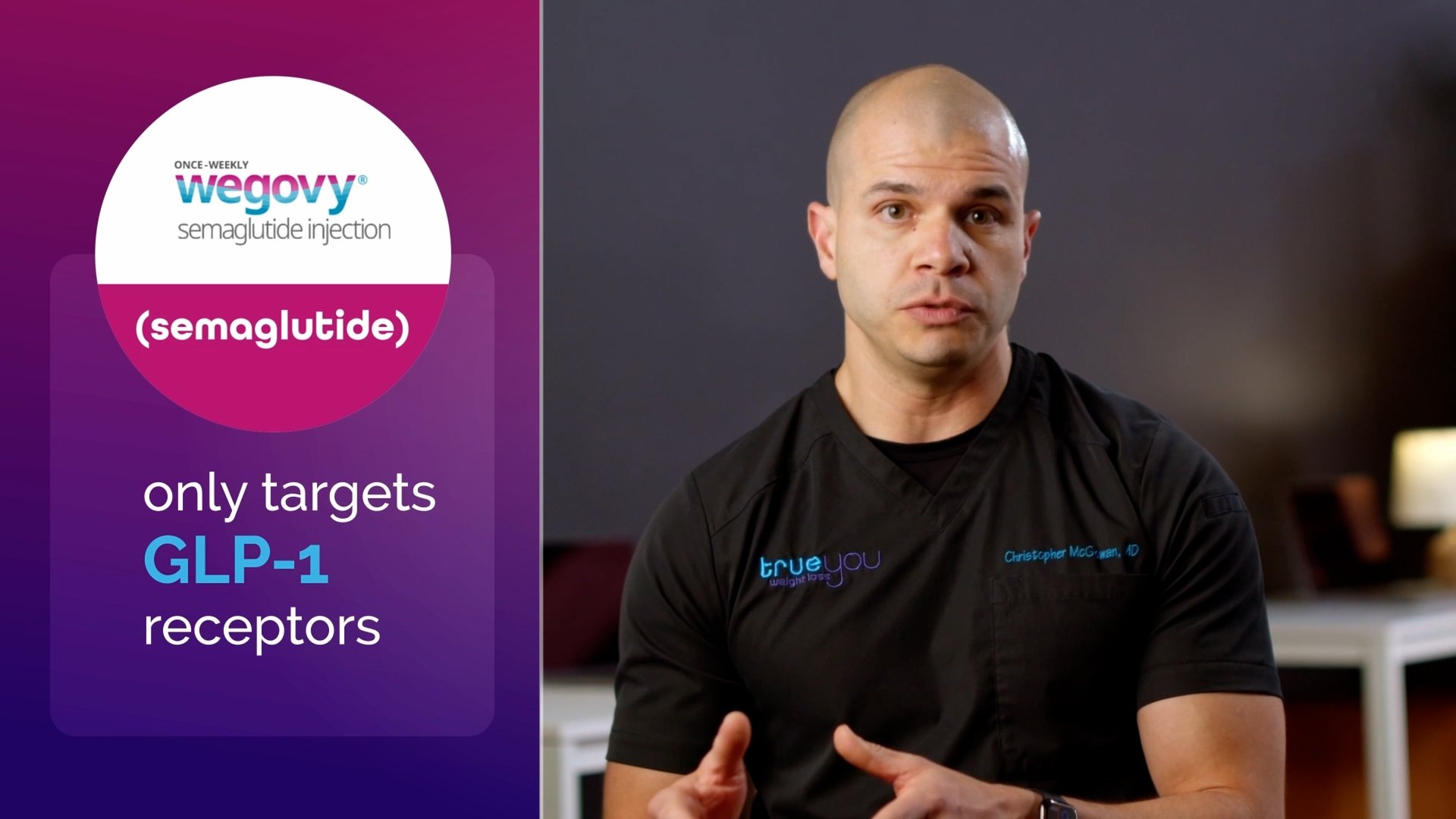
Case study: Wegovy vs. Mounjaro explainer video

Leveraging RX Brand recognition for enhanced learning
Many people may be seeing commercials for these medications online or TV/CTV. They may receive mail about them or see their packaging in pharmacies. Building on that visual association of the brand helps commit their uses and side effects to memory and will help people recognize them more readily in their day-to-day lives.

Consistent labeling and layout
Eliminating small inconsistencies as much as possible and giving your viewer plenty of visual cues reduces cognitive load and helps them make connections faster when learning something new.
Wegovy: pink and always on the left

Mounjaro: orange and always on the right

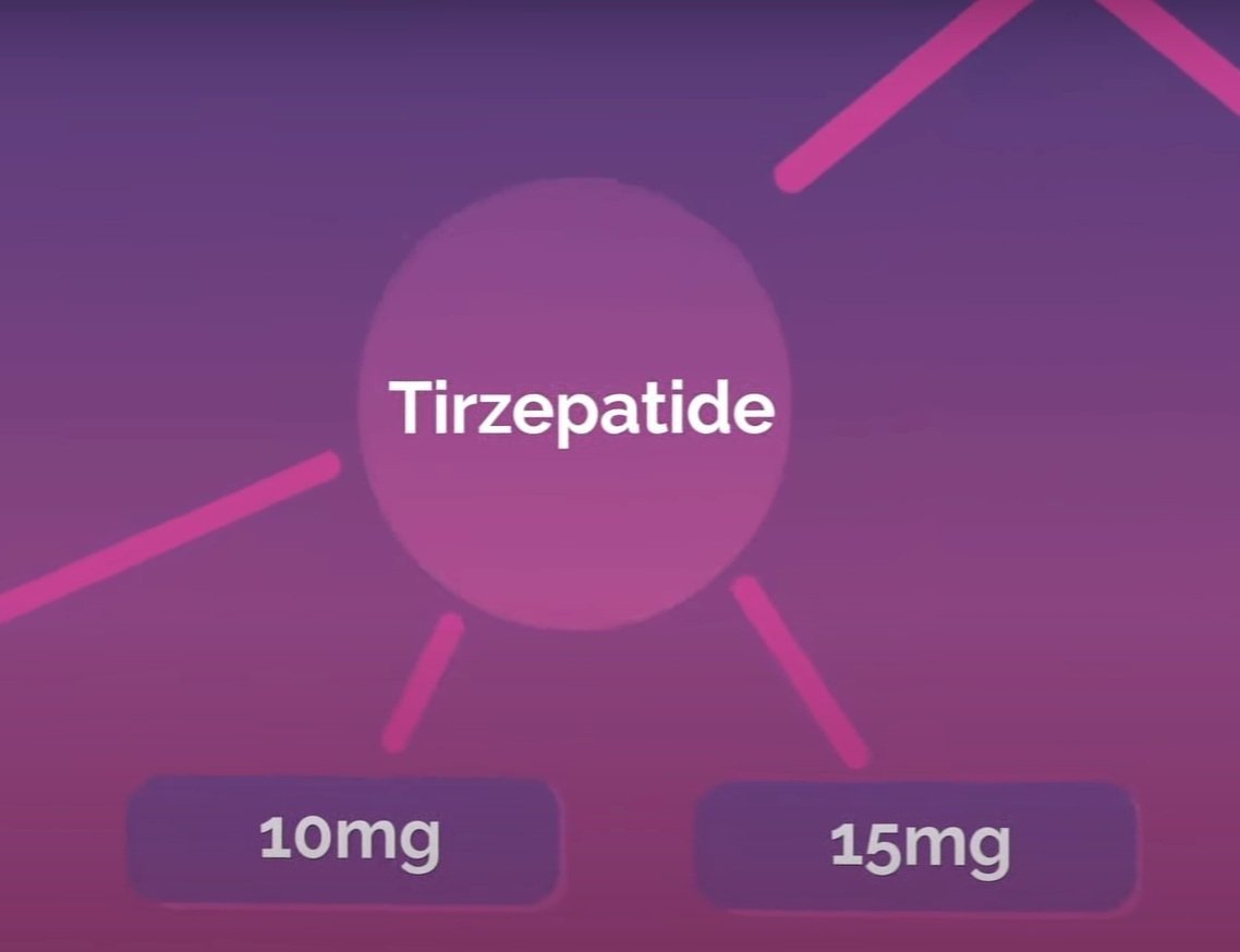
Custom Infographics: Explaining dosing and side effects
Custom infographics are time-consuming for production teams but sometimes necessary for the best learning outcomes.

Although this graph explains a very specific idea, it’s designed to be repurposed for future videos. Text labels are easy to edit and the graph points can be manipulated to fit new data.
Skimmable content
Chapter markers and subtitles | YouTube/Vimeo
I advised Blueforest studios to start exporting Youtube chapter markers with their edits so that the marketing manager could easily add them when uploading to YouTube.
Chapter market benefits
Chapter markers help break up long, information-dense videos into more manageable pieces. This eases cognitive load and also makes the experience more convenient as it gives the viewer the option to skip to parts most relevant to them.
Additional benefits
MOBILE USER BENEFITS
YouTube chapter markers are also visible on Google Search when using a mobile device. This helps viewers to skip chapters when they’re on the go.
SEO BENEFITS
YouTube chapters can help your video show up more on search, especially on mobile. When “how-to” terms and phrases are entered into a search, Google displays its “suggested clips” prominently at the top of search results. For YouTube videos, Google sources those suggested clips from video descriptions but prioritizes chapter markers if you have them!
Intentional Chapter Title Card formats
Customizing the format and tone of the chapter title cards and YouTube chapter markers to fit the audience and the subject matter
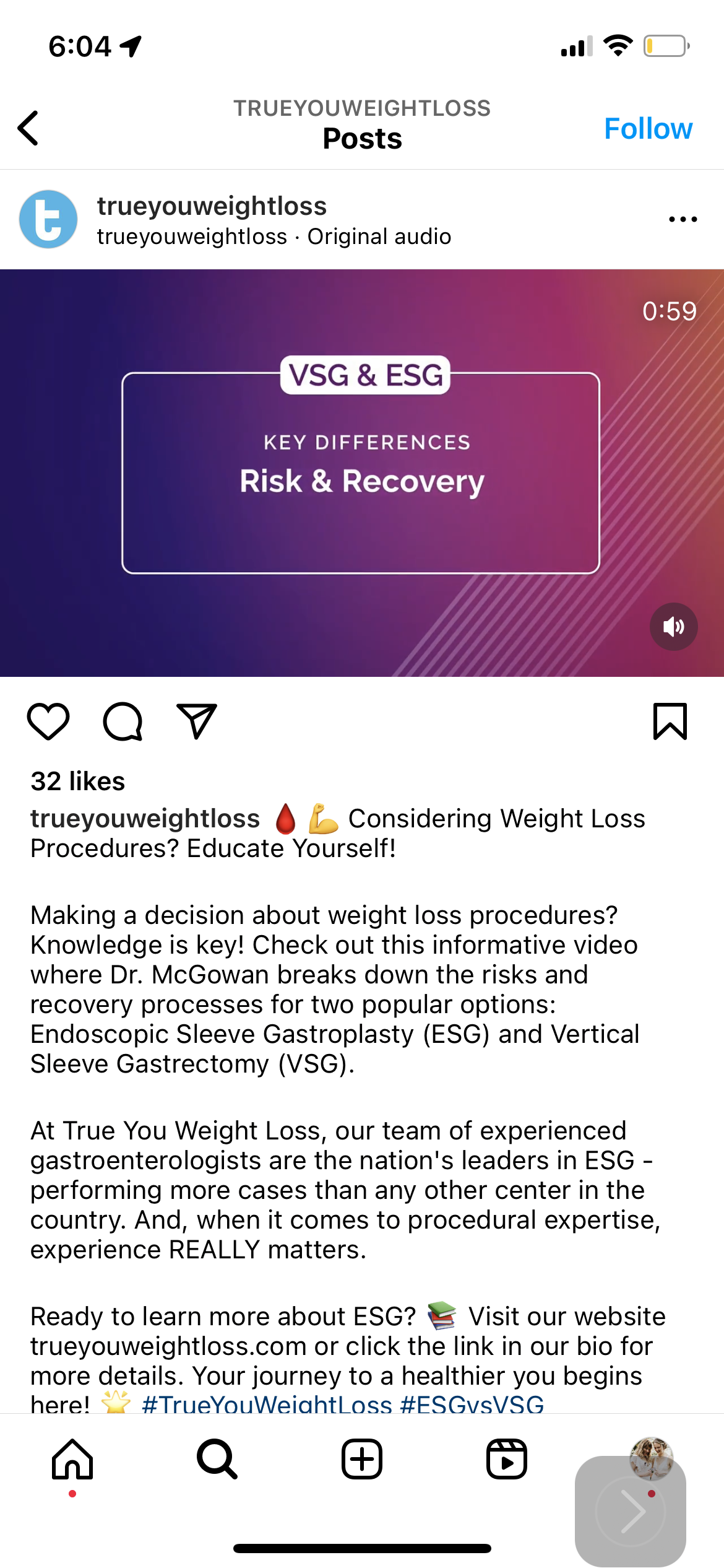
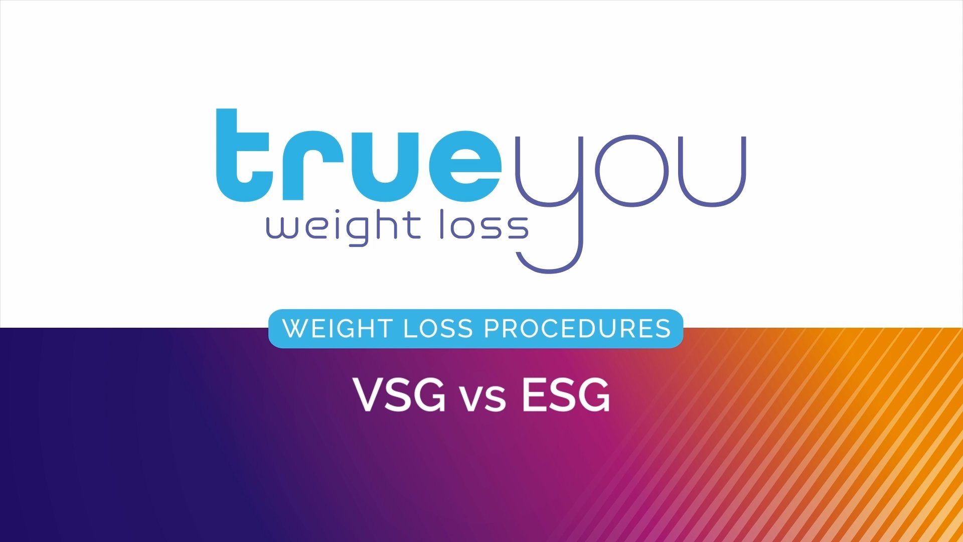
VSG vs ESG Chapter Format | Topics for Comparison
The VSG vs ESG video content was particularly straightforward in that it offered a wide range of quantifiable comparisons between the two procedures regarding methods and results. I mirrored that in its organization.


Grouping video chapters by key differentiators makes it easy for viewers to run their own pros and cons checklist as they move through the material while allowing Dr. McGowen and True You to remain neutral on the subject.


Wegovy vs Mounjaro: FAQ-style
I wrote the Wegovy and Mounjaro chapter cards in an FAQ format rather than direct comparison chapters to appeal to a more general audience and emphasize the comparison as a learning opportunity for understanding weight loss medications in general.
Since weight loss medications are such a hot topic right now among a wide range of patients and audiences, I wanted to make the information as accessible and conversational as possible, letting them know they’re not alone in their questions.


4. Content Scaling
The two-fold strategy behind Title and Chapter cards
Title and chapter markers not only help break up long videos for the user, they benefit the editor and marketing manager as well.
Video title > Chapter subhead > Chapter title
With captions enabled for vision-impaired accessibility, this is all the context a user needs to dive right into the content.
This puts less pressure on the social media manager to write a captivating description.
Marketing manager benefits:
When a social media or marketing manager is scrubbing through a video to post a short clip, chapter title cards are thumb-stopping indicators of where to cut.